Tag: Eco-friendly Solutions

How to conduct your own reporting and research on state trust lands

Contents


Overview

This user guide is designed for both general users and experienced researchers and coders. No coding skills are necessary to work with this dataset, but a basic working knowledge of tabular data files in Excel is required, and for more experienced users, knowledge of GIS. 

Over the past year, Grist has located all state trust lands distributed through state enabling acts that currently send revenue to higher education institutions that benefited from the Morrill Act. We’ve also identified their original Indigenous inhabitants and caretakers, and researched how much the United States would have paid for each parcel, based on an assessment of the cession history (according to the U.S. Forest Service’s record of the land associated with each parcel). We reconstructed more than 8.2 million acres of state trust parcels taken from 123 tribes, bands, and communities through 121 different land cessions — a legal term for the giving up of territory. 

It is important to note that land cession histories are incomplete and accurate only from the viewpoint of U.S. law and historical negotiations, not to Indigenous histories, epistemologies, or historic territories not captured by federal data. The U.S. Forest Service dataset, which is based on the Schedule of Indian Land Cessions compiled by Charles Royce for the Eighteenth Annual Report of the Bureau of American Ethnology to the Secretary of the Smithsonian Institution (1896-1897), covers the period from 1787 to 1894.

This information represents a snapshot of trust land parcels and activity as of November 2023. We encourage exploration of the database and caution that this snapshot is likely very different from state inventories 20, 50, or even 100 years ago. Since, to our knowledge, no other database of this kind — with this specific state trust land data benefitting land-grant universities — exists, we are committed to making it publicly available and as robust as possible.

For additional information, users can read our methodology or go to GitHub to view and download the code used to generate this dataset. The various functions used within the program can also be adapted and repurposed for analyzing other kinds of state trust lands — for example, those that send revenue to penitentiaries and detention centers, which is present in a number of states. 

Note: If you use this data for your reporting, please be sure to credit Grist in the story and please send us a link.

The database administrator can be contacted at landgrabu@grist.org.

What’s in the database

This database contains a GeoJSON and CSVs, as well as a multi-tab spreadsheet that aggregates and summarizes key data points. 

GeoJSON

  1. National_STLs.geojson

CSVs

  1. National_STLs.csv
  2. Tribal_Summary.csv
  3. University_Summary.csv

Excel

  1. GRIST-LGU2_National-STL-Dataset.xlsx, with protected tabs that include:

– Main Spreadsheet
– Tribal Summary
– University Summary

The data can be spatially analyzed with the JSON file using GIS software (e.g. ArcGIS or QGIS), or analyzed with the CSVs or Excel main spreadsheet. To conduct analysis without using the spatial file, we recommend using the National_STLs_ALL_Protected.xlsx sheet, which includes tabs for the summary statistics sheets. The CSVs will mostly be useful for importing the files into GIS software or other types of software for analysis.

Tips for using the database

Summary statistics

To understand the landscape of state trust land parcels at a quick glance, users can reference the summary statistics sheets. The Tribal_Summary.csv and the University_Summary.csv show the total acreage of trust lands associated with each tribe or university, as well as context on what cessions and tribes are affiliated with a particular university or, conversely, what universities and states are associated with individual tribal nations. 

For example, using the University_Summary.csv a user can easily generate the following text: 

“New Mexico State University financially benefits from almost 186,000 surface acres and 253,500 subsurface acres, taken from the Apache Tribe of Oklahoma, Comanche Nation, Fort Sill Apache Tribe of Oklahoma, Jicarilla Apache Nation, Kiowa Tribe, Mescalero Apache Tribe, Navajo Nation, San Carlos Apache Tribe, Tonto Apache Tribe, and White Mountain Apache Tribe. Our data shows that this acreage came into the United States’ possession through 8 Indigenous land cession events for which the U.S. paid approximately $59,000, though in many cases, nothing was paid. New Mexico engages primarily in oil and gas production, renewables, and agriculture and commercial leases.”


Grist

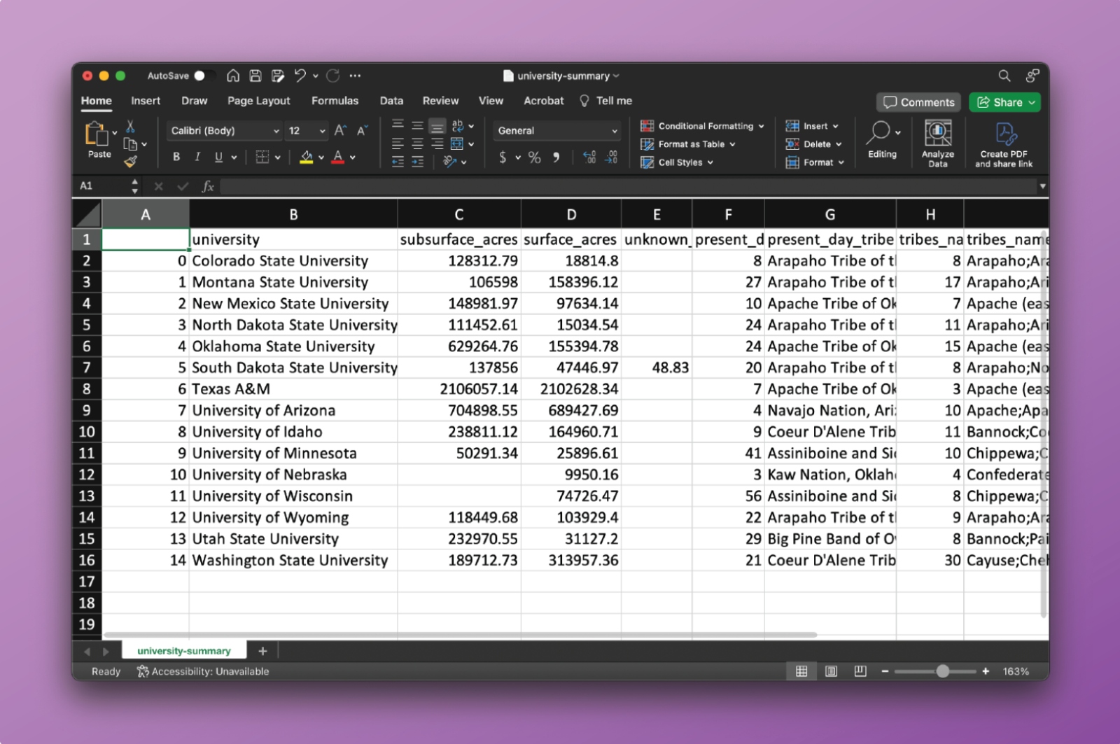
To do so, simply fill in the sections you need from the tabular data of the university summary tab: [column B] benefits from almost [column D] surface acres and [column C] subsurface acres, taken from [column H] tribe (or [column G] total number of tribes). Our data shows that this acreage came into the United States’ possession through [column K] cessions (column K shows total number of cessions) for which the U.S. paid approximately [column F] though in many cases, nothing was paid. New Mexico engages primarily in [National_STLs.csv, column K].

Using Tribal_Summary.csv users can also center stories through Indigenous nations. For example: “The Cheyenne and Arapaho Tribes of Oklahoma ceded almost 66,000 surface acres and 82,500 subsurface acres, through 2 land cession events, for the benefit of Colorado State University, Oklahoma State University, and the University of Wyoming. For title to those acres, the United States paid the Cheyene and Arapaho Tribes approximately $6.00.”

Grist

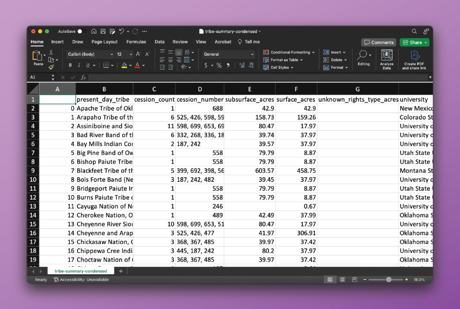
Similarly to the university tab, one can plug in relevant information: [column B] ceded almost [column F] surface acres and [column E] subsurface acres, through [column C] land cession events, for the benefit of [column H].

To get information on how much the United States paid tribes, if anything, filter for the parcels of interest in the ‘Main Spreadsheet’ of the National_STLs.xlsx file and add the price paid per parcel column [column X].

Navigating the data

For users who want to conduct analysis on and understand the landscape of state trust lands without using the spatial file, they can use the protected Excel sheet. (The sheet is protected so that cell values are not accidentally rewritten while users search the information.) 

As an example, if users wanted to do research on a specific institution, they can adjust multiple columns at once in the Excel main spreadsheet to quickly isolate the parcels they are specifically interested in. 

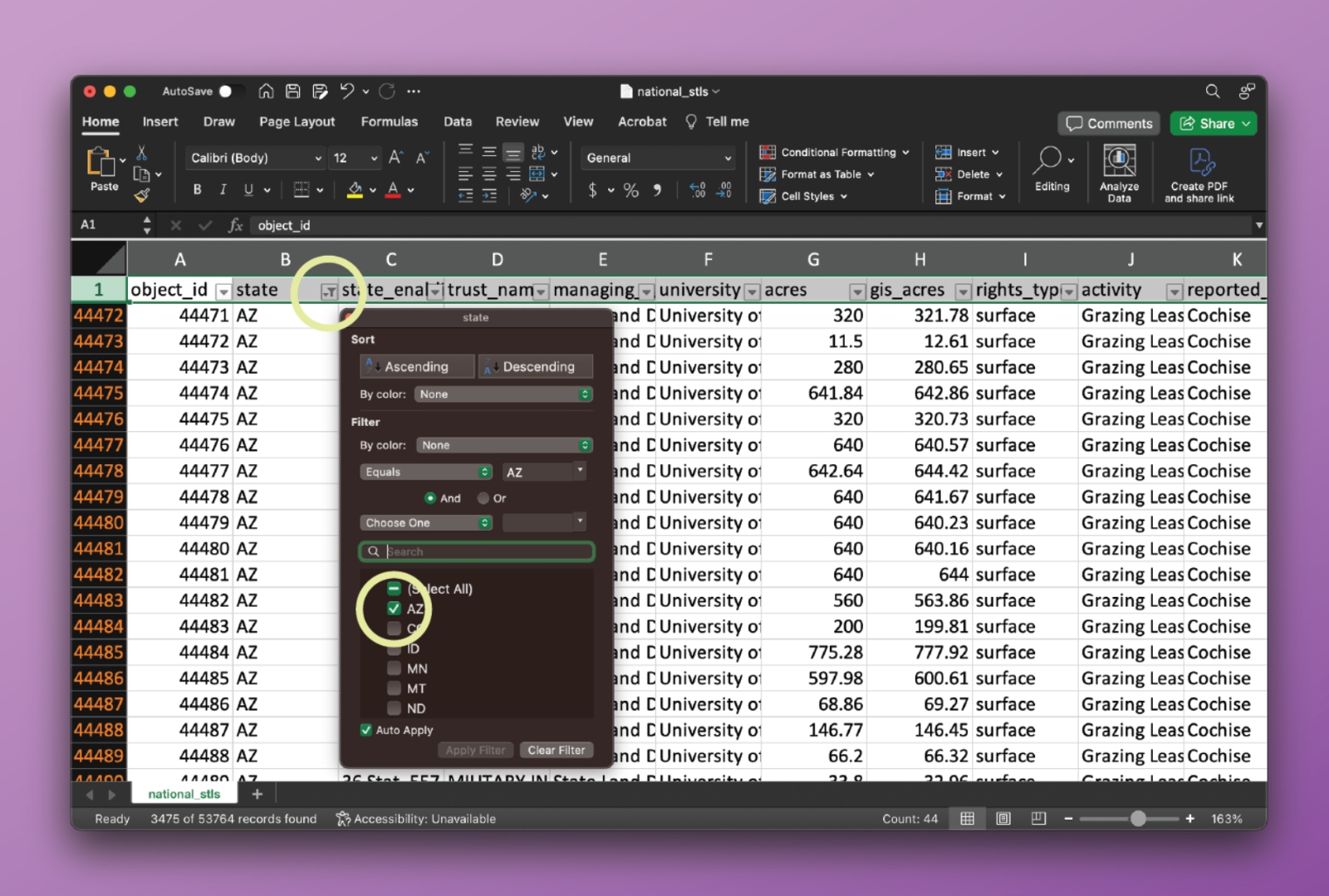
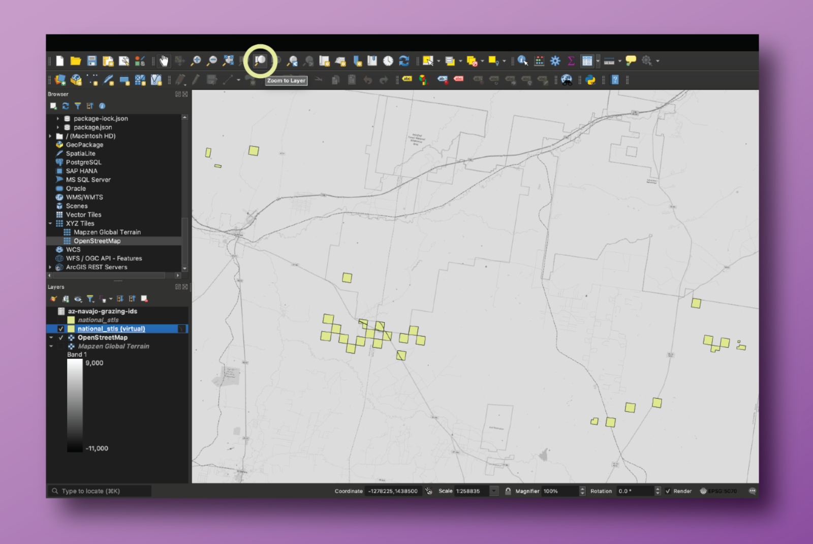
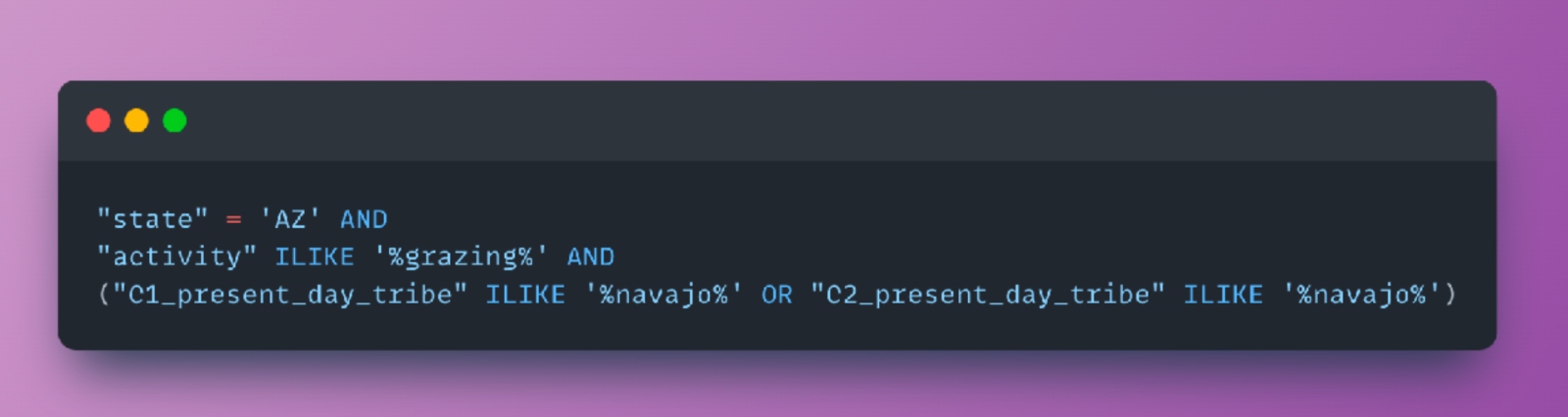
Say a user wanted to figure out how many acres of state trust lands specifically affiliated with the Navajo Nation are used for grazing in Arizona. 

Start by opening the protected National_STLs.xlsx sheet. 

In column B, click the drop-down arrow and select so that only Arizona parcels are showing.

Grist

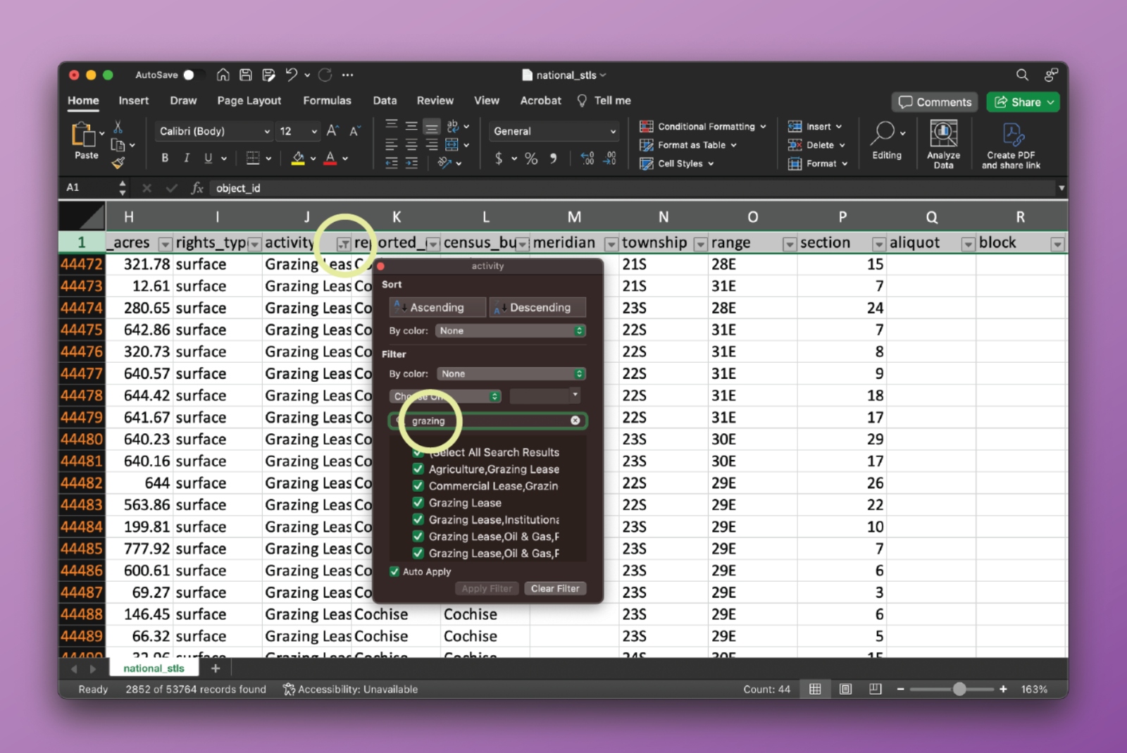
Then, go to column K and use the drop-down menu to select parcels where “grazing” is listed as one of the activities. It’s important to note that many parcels have multiple activities attached to them.

Grist

Then, go through all of the present_day_tribe columns (AA, AE, AI, AM, AQ, AU, AY, BC) and filter for rows that list the Navajo Nation as one of the tribes. It is not always the case that tribes are present in all eight of the columns, and most parcels do not intersect with multiple cession areas. 

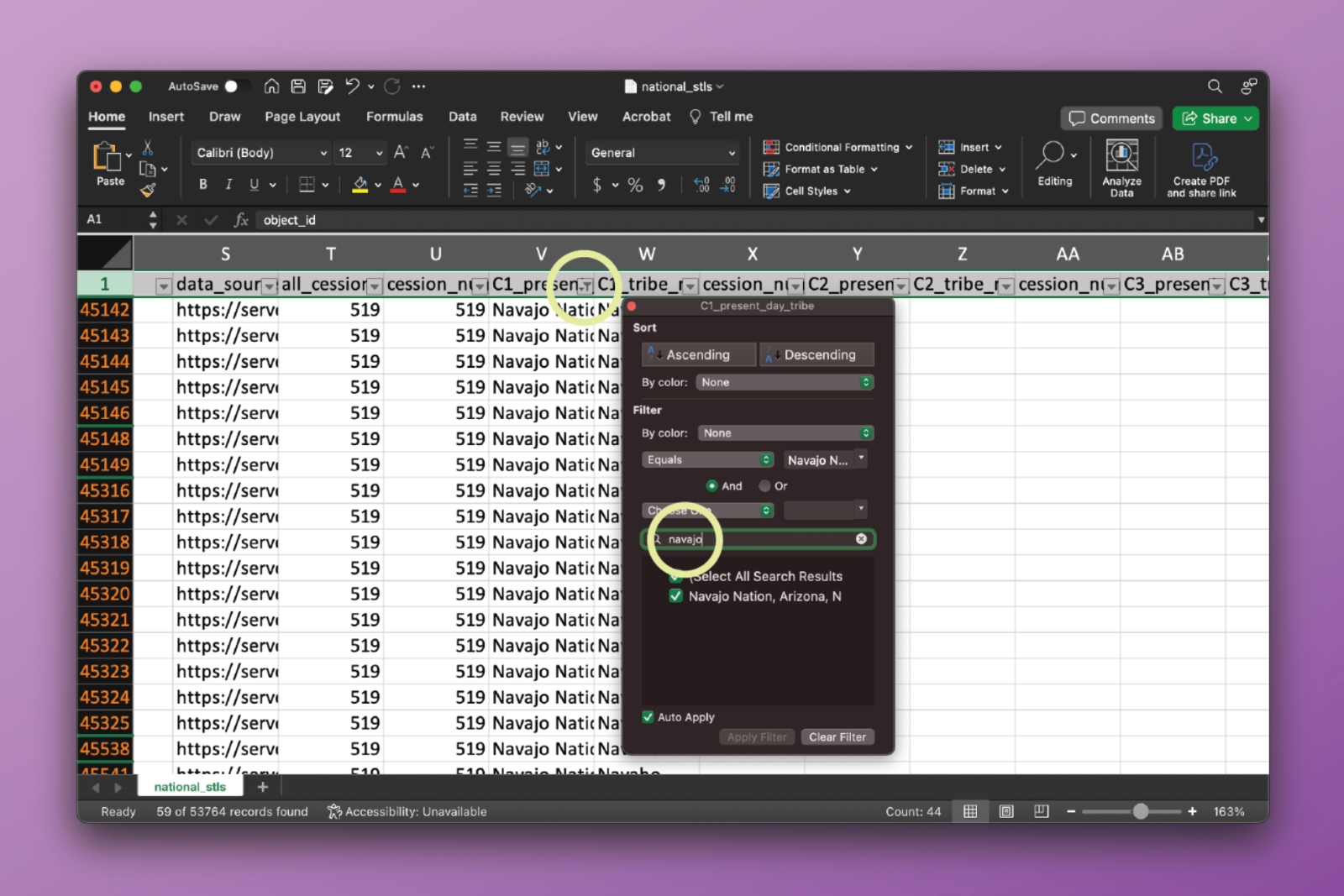
When filtering through a column for specific entries, like selecting all parcels with any grazing present (even if other activities are there), we recommend users open up the filtering drop-down menu, unselect all entries, and then type the query you’re interested in in the search bar, and select the results that show up. 

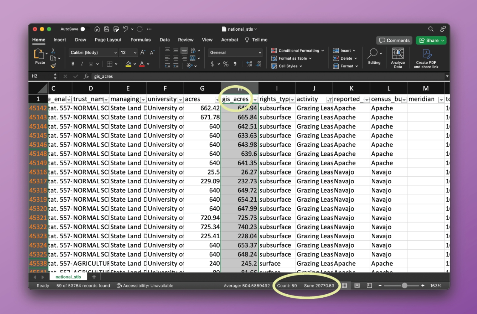
We find a total of 20,278 acres in Arizona that have grazing activity on Navajo land.

Grist

This kind of approach can be used to filter for any combination of parcels, and we encourage you to explore the data this way. 

Visualizing parcels

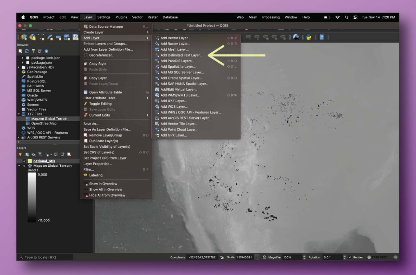
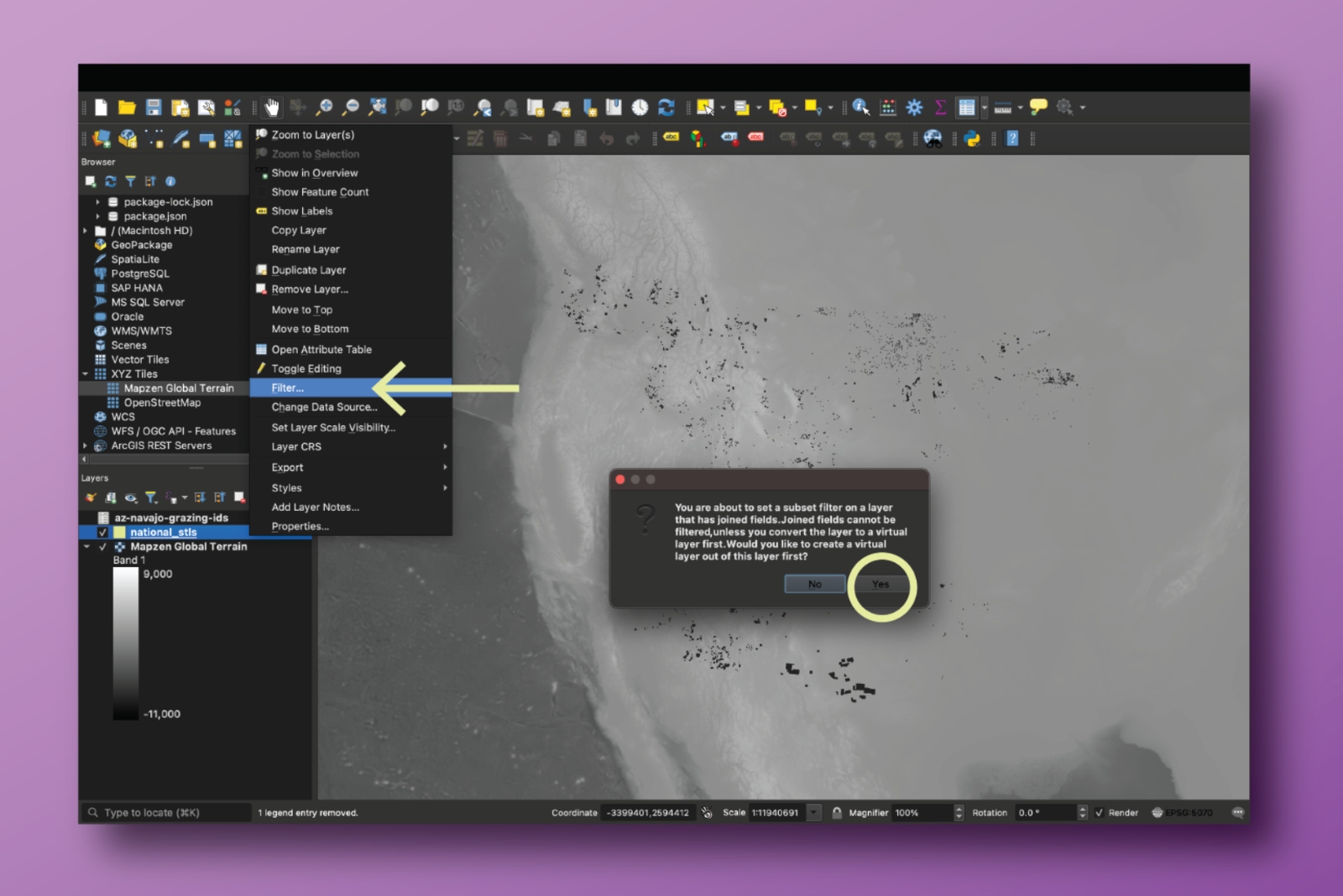
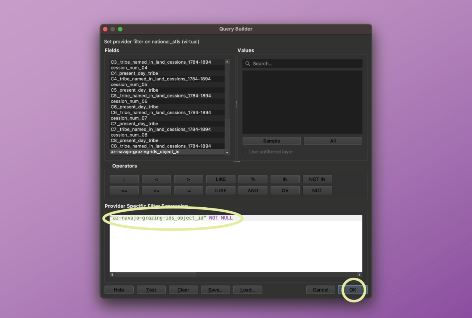
To visualize this data, users can use the GeoJSON file in a GIS program of their choice. If users are unfamiliar with how to filter for specific parcels through those programs, they can identify the exact parcels they want in Excel and then use that to select parcels in a GIS program. 

First, identify the specific parcels of interest using filters (like in the situation described above), and then copy the list of relevant object IDs (in column A) into its own CSV file.

Grist

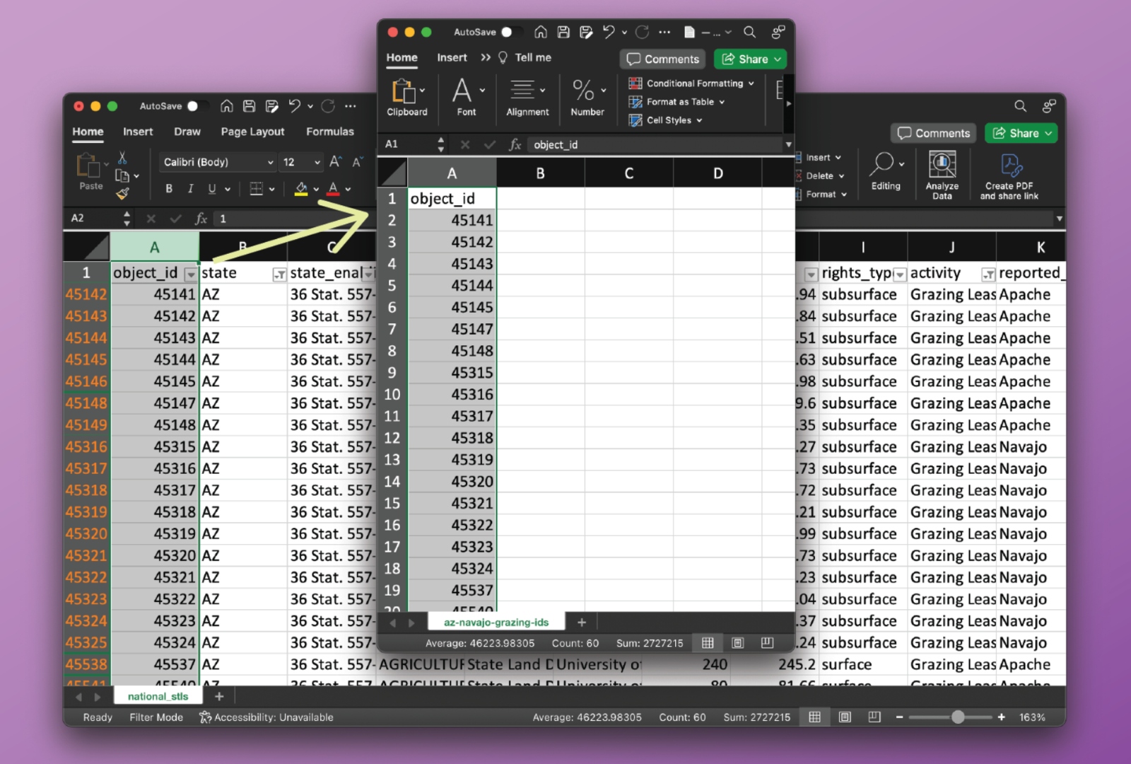
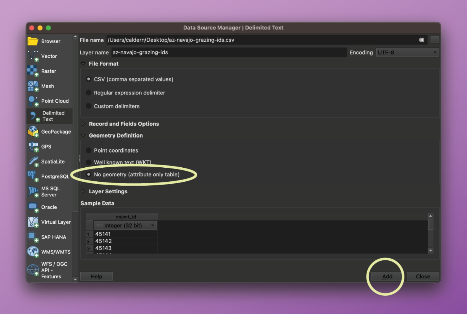
Then, in the GIS software, import the CSV file and join it to the original National_STLs.geojson file. 

Grist
Grist
Grist
Grist

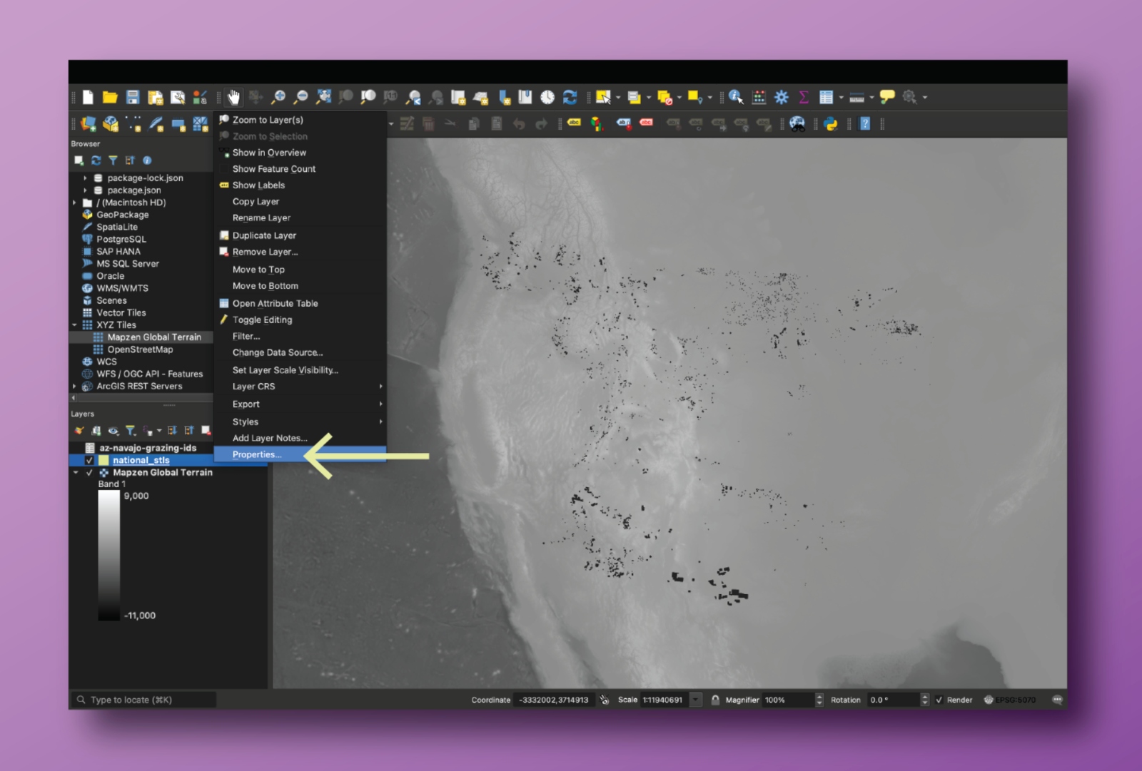
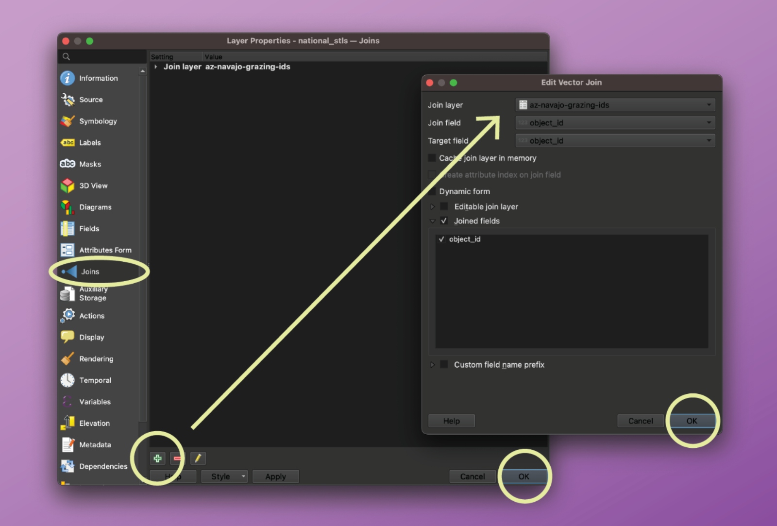
After the file is joined, there will be an additional column to the National_STLs layer, and users can filter out the blank rows (which would be blank because they did not match with parcels of interest in the CSV file) and select the polygons that represent the parcels the user is interested in. 

Grist
Grist

In QGIS, you can use the “Zoom to Layer’” button to visualize the resulting query.

Grist

As an alternative to performing the filtering in Excel and executing the self-join as described above, users may also filter the dataset directly in the GIS program of their choice using structured queries. For example, to replicate the query illustrated above, use the following filter expression in QGIS on the main GeoJSON file:

Grist

Calculating acreage

The acreage of trust lands within a state has been determined as consisting of acres with surface rights or subsurface rights. For further background on this process, please see our methodology documentation

We also included a column for net acreage, since in some places — like North Dakota and Idaho — the state only has partial ownership over some of the parcels. If the field is blank, the state has 100 percent ownership of the parcel. To calculate this, we multiplied the acreage of a parcel by percentage of ownership. 

Missing cession payment

We do not yet have financial information for cession ID 717 in Washington. The cession in question is 1,963.92 acres, and its absence means that the figures for price paid per acre or price paid per parcel are not complete for Washington. 

It is also important to note that when documenting Indigenous land cessions in the continental United States, the Royce cession areas are extensive but incomplete. Although they are a standard source and are often treated as authoritative, they do not contain any cessions made after 1894 and likely miss or in other ways misrepresent included cessions prior to that time. We have made efforts to correct errors (primarily misdated cessions) when found, but have, in general, relied on the U.S. Forest Service digital files of the Royce dataset. A full review, revision, and expansion of the Royce land cession dataset is beyond the scope of this project. 

Missing Oklahoma lands

It’s important to note that we could not find information for 871 surface acres and 5,982 subsubsurface acres in Oklahoma, because they have yet to be mapped, digitally, or because of how they are sectioned on the land grid. We understand that this acreage does exist based on lists of activities kept by the state. However, those lists do not provide mappable data to fill these gaps. In order to complete reporting on Oklahoma, researchers will need to read and digitize physical maps and plats held by the state — labor this team has been unable to provide.

Additional WGS84 files in data generation

In addition to the GeoJSON files output at each step, our workflow produces a version of each GeoJSON file using the World Geodetic System 84 (WGS84) datum and a spherical geographic coordinate system (EPSG:4326). This is the standard coordinate reference system (CRS) for all GeoJSON files according to the specification; prior versions of the specification supported alternate CRSs, but have since been deprecated. In the source code, we rely on GeoPandas’ .to_crs method to perform the transformation to EPSG:4326.

WGS84 versions of GeoJSON files are necessary when mapping datasets using popular web-mapping libraries like Leaflet, Mapbox, MapLibre, and D3. These libraries all expect data to be encoded using EPSG:4326; they expose various projection APIs to reproject data on-the-fly in a browser. You should use the _wgs84 versions of the pipeline’s GeoJSON files if you’re trying to visualize the datasets using one of these libraries. For QGIS users, ensure your project CRS is set to EPSG:4326 before uploading these GeoJSON files.

Using the code

Users will be able to explore the codebase on the GitHub repository, which will be made public upon the lifting of Grist’s embargo. Further details on how to run each step and an explanation of all required files are available in the README.md document.

Creative Commons license

This data is shared under a Creative Commons BY-NC 4.0 license (“Attribution-NonCommercial 4.0 International”). The CC BY-NC license means you are free to copy and redistribute the material in any medium or format; and remix, transform, and build upon the material. Grist cannot revoke these freedoms as long as you follow the license terms. These terms include giving appropriate credit, providing a link to the license, and indicating if changes were made. You may do so in any reasonable manner. Furthermore, you may not use the material for commercial purposes, and you may not apply legal terms or technological measures that legally restrict others from doing anything the license permits. 

More information is available at the CC BY-NC 4.0 deed.

Citation

If you republish this data or draw on it as a source for publication, cite as: Parazo Rose, Maria, et al. “Enabling Act Indigenous Land Parcels Database,” Grist.org, February 2024.

File Descriptions

National_STLs.geojson

The schema for this document is the same as the National_STLs.csv and National_STLs_Protected.xlsx files. 

This spreadsheet contains 41,792 parcels of state trust lands that benefit 14 universities. Each row describes the location of a unique parcel, along with information about the entities currently managing the land, what rights type and extractive activities are associated with the parcel, which university benefits from the revenues, and its historic acquisition by the United States, as well as the original Indigenous caretakers and the current tribal nations in the area. 

An important note about rights type: Washington categorizes timber rights as distinct from surface rights, and we present the data here accordingly. Note that other states do not adhere to this distinction, and thus timber parcels in other states are considered surface parcels. If you would like to generate national summaries of surface rights in a more colloquial sense, consider adding Washington’s timber parcels to your surface calculations.

The file contains the following columns:

object_id

  • A unique, Grist-assigned identifier for the specific state trust land parcel

state

  • State where parcel is located

state_enabling_act

  • Name of the enabling act that granted new territories statehood, along with stipulations of bestowing Indigenous land as a part of the state trust land policy

trust_name

  • Beneficiaries of state trust land revenue can be identified within state government structure by the trust name; we used the trust name to identify the funds that were specifically assigned to the universities we focused on

managing_agency

  • Name of the state agency that manages the state trust land parcels

university

  • Land-grant university that receives the revenue from the associated state trust land parcel

acres

  • Reported acreage of the state trust land parcel from the original data source by the state

gis_acres

  • Acreage calculated by analyzing the parcels in QGIS

net_acres

  • The net acreage of a parcel, determined by the percentage of state ownership related to that parcel specifically. 

rights_type

  • Indicates whether the state/beneficiary manages the surface or subsurface rights of the land within the parcel, or both

reported_county

  • County where parcel is located, as reported by the original data source

census_bureau_county_name

  • County where parcel is located, based on a comparative analysis against Census Bureau data

meridian

  • A line, similar to latitude and longitude lines, that runs through an initial point, which together with the baseline form the highest level framework for all rectangular surveys in a given area. It is also the reference or beginning point for measuring east or west ranges.

township

  • 36 sections arranged in a 6-by-6 square, measuring 6 miles by 6 miles. Sections are numbered beginning with the northeasternmost section (#1), proceeding west to 6, then south along the west edge of the township and to the east (#36 is in the SE corner)

range

  • A measure of the distance east or west from a referenced principal meridian, in units of 6 miles, that is assigned to a township by measuring east or west of a principal meridian

section

  • The basic unit of the system, a square piece of land 1 mile by 1 mile containing 640 acres

aliquot

  • Indicates the aliquot part, e.g. NW for northwest corner or E½SW for east half of southwest corner, or the lot number. 

block

  • A parcel of land within a platted subdivision bounded on all sides by streets or avenues, other physical boundaries such as a body of water, or the exterior boundary of a platted subdivision.

data_source

  • Data on state parcels was acquired either from a records request to state agencies or from requests to a state server; if a state server was used, the website is recorded here

parcel_count

  • In our merge process, we combined some parcels, particularly in Minnesota, and this column captures how many parcels were aggregated together, to maintain accurate parcel count and acreage 

agg_acres_agg

  • The sum of acres across all parcels contained in a given row. For most states, this field will equal that of the acres field. For Minnesota, some small parcels were combined during the spatial deduplication process, and this field reflects the sum of the corresponding acres field for each parcel. (See methodology for more information.) 

all_cession_numbers

  • Refers to all the land cessions (areas where the federal government took the Indigenous land that later supplied state land) that overlap with this given parcel

price_paid_for_parcel

  • The total price paid by the U.S. government to tribal nations

cession_num_01-08

  • A single cession that overlaps a given parcel

price_paid_per_acre

  • The price the U.S. paid (or didn’t pay) per acre, according to the specific cession history

C1[-C8]_present_day_tribe

  • As listed by the U.S. Forest Service, the present day tribe(s) associated with the parcel

C1[-C8]_tribe_named_in_land_cessions_1784-1894

  • As listed by the U.S. Forest Service, the tribal nation(s) named in the land cession associated with the parcel

Tribal_Summary.csv

This spreadsheet shows summary statistics for all state trust land data we gathered, organized by the present-day tribes listed by the U.S. Forest Service.

present_day_tribe

  • As listed by the U.S. Forest Service, the present day tribe(s) 

cession_count

  • Total number of cessions associated with a present-day tribe

cession_number

  • List of cessions associated with a present-day tribe

subsurface_acres

  • Total number of subsurface acres associated with a present-day tribe

surface_acres

  • Total number of surface acres associated with a present-day tribe

timber_acres

  • Total number of timber acres associated with a present-day tribe (only relevant in Washington state)

unknown_acres

  • Total number of acres with an unknown rights type (only relevant for two parcels in South Dakota)

university

  • Universities that receive revenue from the parcels associated with a present-day tribe

state

  • States where the parcels associated with a present-day tribe are located
  • Total number of acres with an unknown rights type (only relevant for two parcels in South Dakota)

university

  • Universities that receive revenue from the parcels associated with a present-day tribe

state

  • States where the parcels associated with a present-day tribe are located

University_Summary.csv

This spreadsheet shows summary statistics for all state trust land data we gathered, organized by land-grant university.

university

  • Land-grant institution that receives revenue from specific state trust land parcels

subsurface_acres

  • Total number of subsurface acres associated with a present-day tribe

surface_acres

  • Total number of surface acres associated with a present day tribe

timber_acres

  • Total number of timber acres associated with a present day tribe (only relevant in Washington state)

unknown_acres

  • Total number of acres with an unknown rights type (only relevant for two parcels in South Dakota state)

price_paid

  • Sum of the price that the U.S. federal government paid to tribes for all the parcels associated with a particular university (the sum of the price paid per parcel column) 

present_day_tribe_count

  • Total number of present-day tribes associated with a land-grant university

present_day_tribe

  • List of present-day tribes associated with a land-grant university

tribes_named_in_cession_count

  • Total number of present-day tribes associated with a land-grant university

tribes_named_in_cession

  • List of present-day tribes associated with a university

cession_count

  • Total number of cessions associated with a land-grant university

all_cessions

  • List of cessions associated with a land-grant university

This story was originally published by Grist with the headline How to conduct your own reporting and research on state trust lands on Feb 7, 2024.

Latest Eco-Friendly News

Controversial Study Says 1.5°C Warming Target Already Breached, ‘Underscores Urgent Need’ to Phase Out Fossil Fuels

A new study using marine sponges collected off the coast of Puerto Rico has found that the planet has already warmed more than 1.5 degrees Celsius.

Researchers analyzed ocean temperature records from sea sponges going back 300 years, a press release from The University of Western Australia (UWA) said. They concluded that global heating had actually increased by 0.5 degrees Celsius more than earlier estimates.

“So rather than the Intergovernmental Panel on Climate Change estimate of average global temperatures having increased by 1.2 degrees by 2020, temperatures were in fact already 1.7 degrees above pre-industrial levels,” said lead author of the study Malcolm McCulloch, who is a professor with the UWA Oceans Graduate School and Oceans Institute, in the press release. “If current rates of emissions continue, average global temperature will certainly pass 2 degrees by the late 2020s and be more than 2.5 degrees above pre-industrial levels by 2050.”

Sponges grow slowly in layers, so they can be studied like time capsules of periods before modern data, reported CNN.

For the study, the researchers used long-lived sclerosponges’ calcium carbonate skeletons to extract ocean temperature records, the press release said.

A researcher takes a specimen of Ceratoporella nicholsoni, which was used to calculate 300 years of temperature changes. Clark Sherman / University of Puerto Rico at Mayagüez

“In particular, we examined changes in the amount of a chemical known as ‘strontium’ in their skeletons, which reflects variations in seawater temperatures over the organism’s life,” McCulloch said in The Conversation.

Using this process, the researchers — who were from UWA, University of Puerto Rico and Indiana State University – concluded that ocean temperatures began to rise in the mid-1860s.

“The sponge records showed nearly constant temperatures from 1700 to 1790 and from 1840 to 1860 (with a gap in the middle due to volcanic cooling). We found a rise in ocean temperatures began from the mid-1860s, and was unambiguously evident by the mid-1870s. This suggests the pre-industrial period should be defined as the years 1700 to 1860,” McCulloch said in The Conversation.

McCulloch said the findings of the study demonstrated that global heating — the combined average of land warming and ocean surface temperatures — had been underestimated by half a degree, primarily during the first stage of the industrial era when shipping coverage was still limited.

“[H]istorical temperature records for oceans are patchy. The earliest recordings of sea temperatures were gathered by inserting a thermometer into water samples collected by ships. Systematic records are available only from the 1850s – and only then with limited coverage. Because of this lack of earlier data, the Intergovernmental Panel on Climate Change has defined the pre-industrial period as from 1850 to 1900,” McCulloch said in The Conversation. “But humans have been pumping substantial levels of carbon dioxide into the atmosphere since at least the early 1800s. So the baseline period from which warming is measured should ideally be defined from the mid-1700s or earlier.”

McCulloch said the study also found that land surface warming has been accelerating more quickly, meaning even the two degree goal established by the Paris Agreement was at risk.

“Since the late 20th century, land-air temperatures have been increasing at almost twice the rate of surface oceans and are now more than 2°C above pre-industrial levels. This is consistent with well-documented decline in Arctic permafrost and the increased frequency around the world of heatwaves, bushfires and drought,” McCulloch said in The Conversation.

The study, “300 years of sclerosponge thermometry shows global warming has exceeded 1.5 °C,” was published in the journal Nature Climate Change.

“The now much faster rates of land-based warming also identified in the study are of additional concern, with average land temperatures expected to be about 4 degrees above pre-industrial levels by 2050,” McCulloch said in the press release. “Keeping global warming to no more than 2 degrees is now the major challenge, making it even more urgent to halve emissions by early 2030, and certainly no later than 2040.”

The findings of the study have been called into question by other scientists who say it has an excessive amount of limitations and uncertainties and could result in public confusion regarding climate change, CNN reported.

One of the main arguments against the accuracy of the findings is that the researchers used just one type of marine sponge from a single location to represent temperatures across the globe.

NASA climate scientists Gavin Schmidt said that — given the range of temperatures on Earth — estimating the average temperature worldwide requires data from the greatest number of locations possible.

“Claims that records from a single record can confidently define the global mean warming since the pre-industrial are probably overreaching,” Gavin said in a statement, as reported by CNN.

The study emphasizes the urgency of reducing fossil fuel emissions as quickly as possible.

“Our revised estimates suggest climate change is at a more advanced stage than we thought. This is cause for great concern,” McCulloch said in The Conversation. “It appears that humanity has missed its chance to limit global warming to 1.5°C and has a very challenging task ahead to keep warming below 2°C. This underscores the urgent need to halve global emissions by 2030.”

The post Controversial Study Says 1.5°C Warming Target Already Breached, ‘Underscores Urgent Need’ to Phase Out Fossil Fuels appeared first on EcoWatch.

Latest Eco-Friendly News

How to Choose Chocolate That’s Truly Sustainable

Like with so many products, staring at the shelf of chocolate chips and baking bars can be overwhelming. What are the “right” labels to pay attention to: “Certified Compostable,” “Direct Trade” or “Fair Trade?” Does higher price mean better wages for the workers that produced it? Cacao is produced in humid regions near the equator — mainly Central and South America and West Africa. So unless you live in this region, the cocoa beans used to make your chocolate need to travel long distances. When choosing between different brands of chocolate, here’s what to pay attention to. 

Why Does It Matter? 

Betsabeth Alvarez, a 98-year-old Afro-Colombian farmer, takes a break during a harvest on a traditional cacao farm in Cuernavaca, Colombia on Dec. 1, 2021. Jan Sochor / Getty Images

Chocolate is a $128 billion dollar industry, and the average American consumes about 12 pounds of chocolate every year. However, chocolate production is tied to both labor and human rights violations, as well as environmentally destructive practices. With such a huge market for chocolate products, choosing ethical and sustainably produced options can make a difference. 

Labor issues — particularly child labor — are widespread in the cocoa industry. Forced labor for low wages and dangerous working conditions are commonplace. About 70% of the world’s cocoa comes from Ghana and the Ivory Coast (or Côte d’Ivoire), where over 2 million children are known to work illegally on cocoa plantations. Hershey, Mars and Nestlé — some of the best-known chocolate brands in the world — cannot guarantee that they produce their chocolate without child labor, and have consistently missed deadlines they’ve established to eradicate such labor from their supply chains. 

Cocoa bean production has long been associated with deforestation and water use. Like lots of agricultural industries, cocoa production often entails cutting down forests for farmland. Ghana and the Ivory Coast in western Africa produce most of the world’s cocoa, and have lost the majority of their forest cover in the past 60 years, approximately a third of which is attributed directly to cocoa plantations. According to the National Wildlife Federation, tropical trees are being lost quickly in the places where cocoa is grown due to deforestation, which is directly linked to the loss of worldwide migratory songbird populations. Additionally, 21 liters of water are needed to produce one small chocolate bar.

The Problem With Labels 

A Fairtrade logo on the packaging of chocolate in Baden-Wuerttemberg, Stuttgart, Germany on Dec. 4, 2018. Lena Klimkeit / picture alliance via Getty Images

You might recognize some of those stamps on chocolate products, some of which are on other groceries like coffee, sugar or tea. These stamps — like Fairtrade Certified, Fair for Life, and Rainforest Alliance Certified Cocoa — indicate that the products have been certified and endorsed by specific organizations. Different organizations focus on different things when granting their certifications. Fairtrade, for example, focuses on poverty alleviation and labor standards, and UTZ and Rainforest Alliance focus largely on environmental protection. 

“Fair trade” labels, however, aren’t a guarantee. Fairtrade International and Rainforest Alliance/UTZ Certifiers are among the most well-known certifications that consider labor practices, but they are only required to visit 10% of cocoa farms when determining whether a product is fit for their label. Sierra Magazine reports that Tony’s Chocolonely — a popular chocolate brand that is Fairtrade Certified — also states that their chocolate is “100% free from exploitation,” but admittedly found 1,700 cases of child labor in the production of their products.

So, while these labels might provide a good place to start when choosing chocolate products, they aren’t necessarily a guarantee of their practices and ethics. 

So, What Can Be Done?

Pay Attention to Packaging 

The packaging of food products is often plastic, which either sits in landfills after disposal, or makes its way into oceans where it breaks down into microplastics. Some companies boast of their “compostable” packaging made of bioplastics. Because these often require special industrial composting facilities to be processed, bioplastics are sometimes sent to landfills anyway. In fact, these compostable products might even cause further environmental damage, as anything organic in landfills emits methane during its slow decomposition. 

Chocolates selected for Slow Food Nation, a food festival promoting sustainability, eco-friendly farming and organic foods in San Francisco, California on Aug. 25, 2008. Liz Hafalia / The San Francisco Chronicle via Getty Images

Choose products with minimal or paper packaging, especially those made out of recycled materials or that can be recycled. Some paper wrappers are compostable at home; just make sure to read the labels and confirm before purchasing. Ordering online also entails extra packaging and extra shipping processes that emit fossil fuels, so in-person purchasing is best.

Avoid Palm Oil 

A lot of chocolate producers use palm oil in their products to improve texture and appearance. Unlike other oils, palm oil is solid when at room temperature, which makes it advantageous in chocolate. Deforestation and clear-cutting are commonplace in the formation of palm oil plantations. These processes remove important carbon sinks, and devastate landscapes and the species that live there, like Orangutans, pygmy elephants and Sumatran rhinos. Check the ingredients on chocolate products and choose those without palm oil.

Choose Organic 

Chocolate bars from the Dagoba and Endangered Species brands. Tanke Çelik / Flickr

While not a perfect standard, the USDA organic label is pretty stringent, and relates to the growing process of products. Organic cocoa beans are “shade grown,” which creates habitats for birds and contributes to a healthier, more diverse ecosystem. They’re also grown without synthetic pesticides and fertilizers, making them a more sustainable choice than conventional chocolate products. 

Choose Brands That Have Been Vetted by Third Parties 

Endangered Species brand chocolate bars. Marty Caivano / Digital First Media / Boulder Daily Camera via Getty Images

Instead of only following certifications on chocolate products, choose those that are recommended by other environmental and human rights groups. Food Empowerment Project has a recommendations list of hundreds of brands that they confidently recommend, those with mixed results, and many that they do not recommend, even if they are stamped with certifications. They also have an app for referencing on the go. Other lists by Slave Free Chocolate, The Good Shopping Guide, Green America and Chocolate Scorecard also provide a good starting point. 

Divine brand chocolate bars. Brett Jordan / CC BY 2.0

Regarding specific brands, the National Wildlife Federation recommends Endangered Species Chocolate, Equal Exchange and Divine Chocolate. The Sierra Club recommends The Good Chocolate’s (TGC) large bars, which are organic and contain no palm oil or plastic, and can be shipped without excess packaging, as well as Sjaaks and Equal Exchange’s Organic Dark Chocolate Minis. Remember too that higher prices don’t necessarily mean better practices or wages for the farmers who produce it. 

Research a Company Yourself 

Look at the FAQs for a company, and see if they mention how their chocolate is sourced — or contact them directly with your questions. See if they have sustainability goals, or an impact report that you can reference.

Another good tactic is to look into whether vendors have direct relationships with their farmers, and know exactly where their ingredients come from. This is sometimes called a “bean-to-bar” product, or you might see a package stamped with the term “direct trade,” which isn’t a certification, but simply means that the producer of the beans has a relationship with the buyer, and the ingredients within the chocolate are traceable. Beyond Good is one such company, which makes single-origin chocolate bars with cocoa produced in Madagascar.

The post How to Choose Chocolate That’s Truly Sustainable appeared first on EcoWatch.

Latest Eco-Friendly News

Second Atmospheric River Storm Brings Heavy Rain, Flooding and Mudslides to Southern California

The powerful atmospheric river storm that arrived in California on Sunday continued to bring heavy rain, flooding and mudslides to the southern parts of the state Monday.

Parts of California and Arizona were under high wind, flood and winter storm warnings yesterday, with residents encouraged to limit driving, authorities said, as Reuters reported.

The storm dumped a record amount of rainfall on Los Angeles, with more than 10 inches since Sunday, the National Weather Service (NWS) said.

“We’re talking about one of the wettest storm systems to impact the greater Los Angeles area,” said Ariel Cohen, NWS chief meteorologist in Los Angeles, as reported by The Guardian. “Going back to the 1870s, this is one of the top three.”

The campus of the University of California, Los Angeles, saw almost a foot of rain in a 24-hour period.

Meteorologists said flooding and dangerous landslides remained a concern with the ground still saturated from the deluge.

The NWS forecast for the Los Angeles and Oxnard area called for a continuation of rain, mountain snow and the potential for thunderstorms through Tuesday evening, with showers lingering through Friday.

“Snow levels will lower each day with mountain snow issues increasing,” the NWS forecast warned. “The tail end of the atmospheric river that has been plaguing the area is over the eastern portion of LA county. The unstable airmass is now over the counties to the west of LA county and steadier rain will be replaced by more showery conditions.”

President Joe Biden offered federal aid to Mayor of Los Angeles Karen Bass and California Governor Gavin Newsom for hard-hit areas, the White House said, as Reuters reported.

At least 130 incidents related to flooding had been reported as of Monday morning, Kristin Crowley, LA’s fire chief, said.

One man had to be rescued by a helicopter belonging to the fire department after he jumped into the concrete Pacoima Wash flood channel to save his dog, according to fire department officials. Both the man and the dog made it to safety.

The heavy rain and snow were part of an atmospheric river storm system — a current of dense moisture brought inland from the Pacific. Both the more recent storm and another that affected the region on Wednesday and Thursday of last week were the type of atmospheric river storm called a “Pineapple Express” — so named because it originates in Hawaii’s subtropical waters.

On Sunday, winds of up to 75 miles an hour brought down utility lines and trees on the state’s central coast and the San Francisco area, leaving roughly 875,000 residences without power.

At least three people were killed by falling trees during the storm.

Two landslides came together in the Beverly Crest neighborhood, inundating it with mud, reported The Guardian. Meanwhile, a “whole hillside” was brought down in the Hollywood Hills.

“I was driving up here last night, right after the Grammys, and coincidentally, my neighbor, who was in this SUV behind us, was being dropped off at his house, and the driver’s coming down the hill, and the mud is chasing the driver,” said Jeb Johenning, a resident of Beverly Hills, as Reuters reported.

Flooding continued to be a danger, as dozens of people were rescued across the state, mostly from their cars, said Governor’s Office of Emergency Services spokesperson Brian Ferguson.

Ferguson said several neighborhoods with an especially high risk of mudslides and flash flooding were evacuated.

“We’re not out of the woods yet. There could continue [to] be very dangerous impacts all through Southern California today and tomorrow,” Ferguson warned.

The post Second Atmospheric River Storm Brings Heavy Rain, Flooding and Mudslides to Southern California appeared first on EcoWatch.

Latest Eco-Friendly News

Scientists Propose New Category 6 for Stronger Hurricanes Linked to Climate Change

In a new study, scientists proposed adding a Category 6 on the Saffir-Simpson Hurricane Wind Scale to describe stronger hurricanes linked to global warming.

The study titled “The growing inadequacy of an open-ended Saffir–Simpson hurricane wind scale in a warming world” and published in Proceedings of the National Academy of Sciences noted that global warming and rising ocean temperatures were contributing to stronger hurricanes. 

The climate scientists behind the study, Michael Wehner of Lawrence Berkeley National Laboratory (Berkeley Lab) and James Kossin of First Street Foundation, wrote that tropical cyclones have become so intense amid global warming that a higher category may be necessary to convey the greater dangers of more powerful storms.

The Saffir-Simpson Hurricane Wind Scale has been used for over five decades, ranking hurricanes from Category 1 to Category 5. As the study authors noted, the highest category, Category 5, has no upper limit; instead it encompasses hurricanes with wind speeds of 157 mph or more. According to the scale, a Category 5 hurricane includes a risk of “catastrophic damage” that will destroy framed homes, fell trees and lead to long-lasting power outages.

But the scientists pointed out that greater wind speeds do increase intensity and risk that could be better explained with an additional category.

“Our motivation is to reconsider how the open-endedness of the Saffir-Simpson Scale can lead to underestimation of risk, and, in particular, how this underestimation becomes increasingly problematic in a warming world,” Wehner said in a statement.

The proposal would define Category 5 storms from 70 to 80 m/s (about 157 to 192 mph), then add a Category 6 ranking for storms with winds over 192 mph. The proposed Category 6 could already apply to previous tropical storms, including Typhoon Haiyan, Hurricane Patricia, Typhoon Goni and Typhoon Meranti.

The study revealed that the risk of storms that could be categorized in the proposed Category 6 would increase by 50% around the Philippines and doubles around the Gulf of Mexico if global warming reaches 2°C compared to preindustrial levels. Overall, the study authors found that the risk of storms with an intensity that could rank as Category 6 has more than doubled since 1979.

“Tropical cyclone risk messaging is a very active topic, and changes in messaging are necessary to better inform the public about inland flooding and storm surge, phenomena that a wind-based scale is only tangentially relevant to. While adding a sixth category to the Saffir–Simpson Hurricane Wind Scale would not solve that issue, it could raise awareness about the perils of the increased risk of major hurricanes due to global warming,” Kossin explained. “Our results are not meant to propose changes to this scale, but rather to raise awareness that the wind-hazard risk from storms presently designated as Category 5 has increased and will continue to increase under climate change.”

The post Scientists Propose New Category 6 for Stronger Hurricanes Linked to Climate Change appeared first on EcoWatch.

Latest Eco-Friendly News

Category 6-level hurricanes are already here, a new study says

A super-hurricane is brewing in the Atlantic Ocean in the opening pages of The Displacements, a novel by Bruce Holsinger published in 2022. “This is the one the climatologists have been warning us about for twenty years,” one character declares. Forty pages in, so-called Hurricane Luna makes a surprise turn for Miami and ends up demolishing Southern Florida with a wall of water, buckling skyscrapers, leveling wastewater plants, and filling the Everglades with contaminated silt. With 215-mile-per-hour winds, faster than a severe tornado, the fictional Luna is the world’s first Category 6 hurricane. 

In the real world, Category 5 is synonymous with the biggest and baddest storms. But some U.S. scientists are making the case that it no longer captures the intensity of recent hurricanes. A paper published Monday in the Proceedings of the National Academy of Sciences lays out a framework for extending the current hurricane-rating system, the Saffir-Simpson scale, with a new category for storms that have winds topping 192 miles per hour. According to the study, the world has already seen storms that would qualify as Category 6s.

“We expected that climate change was going to make the winds of the most intense storms stronger,” said Michael Wehner, a coauthor of the paper and an extreme weather researcher at Lawrence Berkeley National Laboratory. “What we’ve demonstrated here is that, yeah, it’s already happening. We tried to put numbers on how much worse it’ll get.”

There’s a reason that books like The Displacements invoke Category 6: It grabs your attention, warning of a threat that’s like nothing you’ve never encountered. The concept could help the public grapple with the dangers that climate change is bringing, like more intense storms. But some experts aren’t convinced it would be helpful to work “Category 6” into our hurricane vocabularies.

What storms would count as a Category 6?

The idea of adding a Category 6 has surfaced several times in the last few decades, as storms like Hurricane Dorian in 2019 delivered some of the highest wind speeds on record (185 miles per hour) and flattened whole towns in the Bahamas. The current Category 5 designation refers to any tropical cyclone with wind speeds higher than 157 miles per hour.

The new threshold of 192 miles per hour for a Category 6 would have captured some of the strongest storms ever observed. Wehner and his coauthor James Kossin, a scientist at the climate nonprofit First Street Foundation, found that at least five storms have already reached this tier, and that all of them occurred in the last decade, a signal that a warming world is creating more monster storms. The most powerful of these gales, Hurricane Patricia, slammed into Mexico’s Pacific Coast in 2015 with winds that peaked at 215 miles per hour. By a stroke of good fortune, the storm hit a relatively unpopulated region, causing only six deaths. When another one of the most powerful storms, Typhoon Haiyan, struck the Philippines in 2013 with winds of 195 miles per hour, it killed more than 6,000 people, making it one of the deadliest disasters in modern history.

The Gulf of Mexico hasn’t seen a storm with such high winds in the modern era, but the authors found that conditions in the region are already ripe for a Category 6. That’s because climate change is making the ocean and atmosphere warmer, providing fuel for more intense hurricanes. By undertaking an analysis of atmospheric conditions in the Atlantic, Wehner and Kossin found that there have been several occasions when the Gulf has been hot enough to support a storm with winds of more than 190 miles per hour — it’s just dumb luck that one hasn’t happened yet. As the world gets hotter, the odds that we’ll see such a storm get higher: The authors find that 2 degrees Celsius of warming would triple the risk of a Category 6 storm forming in the Atlantic in any given year.

The pitfalls of adding a new category

It’s becoming clear that flooding is the deadliest aspect of a hurricane. Storm surges account for roughly half of deaths from hurricanes in the United States, and flooding from heavy rain is responsible for more than a quarter, according to the study. By contrast, high winds are behind just 8 percent of deaths. Since the Saffir-Simpson scale is based solely on the speed of their winds, it doesn’t communicate the risks that people should be most concerned about, yet it’s the main thing people usually know about an oncoming storm. 

“The point is, adding a Category 6 just amplifies the miscommunication of the greatest hurricane risks,” said Marshall Shepherd, a professor of atmospheric sciences at the University of Georgia. 

Photo of homes submerged in dark water.
Floodwaters isolate homes in the aftermath of Hurricane Florence in 2018 in Lumberton, North Carolina.
Joe Raedle / Getty Images

The public is already confused by the jargon in hurricane forecasts, like the “cone of uncertainty” that shows a storm’s projected path, or the difference between a “watch” and a “warning.” Shepherd thinks adding a new category could make that worse. 

“You know, people are creatures of habit,” he said. “They have been conditioned to believe that Cat 5 is the strongest hurricane. ‘OK, now, well, what are the categories?’ To me, it creates a lot more communication inconsistencies and confusion for the public.” 

People often base their evacuation decisions on a storm’s Saffir-Simpson category, according to Jennifer Collins, a professor of geoscience at the University of South Florida. When Hurricane Florence was downgraded from a Category 4 to Category 1 before its landfall in the Carolinas in 2018, people who had evacuated actually turned around and came back, encountering severe flooding as a result, Collins said.

“When they hear Category 5, I think people will react to it,” Collins said. “It’s really when we use those lower categories that people are not reacting when they should.” National Hurricane Center experts have said in the past that adding a new category wouldn’t do much good, since a Category 5 is already considered catastrophic. Since the National Hurricane Center is in charge of the Saffir-Simpson scale, Category 6 won’t happen unless those experts are convinced it’s needed.

The authors of the new paper don’t think that extending the category system would fix these hurricane-communication problems. “We’re not trying to address these other inadequacies,” Wehner said. “We’re trying to raise awareness that climate change is increasing the risk of intense storms, and not just Category 6, but also category 4 and 5.” 

While it’s difficult to predict exactly how people would respond to a Category 6 storm, Jennifer Marlon, a research scientist at the Yale Program on Climate Change Communication, thinks the designation would be helpful. “It would send a clear signal to coastal residents that your past experience with storms is not a good measure of future impacts,” Marlon said in an email. “Storms are no longer ‘all natural,’ and they’re getting stronger.” 

A better way to communicate hurricane risks?

These days, when a hurricane is headed toward the coast, Shepherd doesn’t talk much about its category at all. Instead, he focuses on explaining threats from storm surge and flooding, sharing visuals that show the risks. 

Over the last decade, the National Hurricane Center has been experimenting with new storm surge maps that highlight the risk of inland flooding rather than the wind speed of a storm. In the lead-up to hurricanes like Ian in 2022, for instance, the agency published new maps every few hours that showed how many feet of flooding will hit each segment of the coast. These maps are simple and easy to understand, and they’ve become a more central part of the NHC’s attempts to communicate storm risk in recent years.

Map of Florida with color-coded outlines along the coast showing where storm surge will be most severe.
A map shows the peak storm surge forecast ahead of Hurricane Ian’s landfall in 2022. NOAA / National Weather Service

“We likely have entered a new generation of hurricanes, in terms of intensity and rapid intensification,” Shepherd said. “I don’t want to downplay or underplay that, because that’s critical. So instead of worrying about characterizing a new category, my broader message is, ‘OK, what are we going to do, from an adaptation and a resiliency standpoint, to this new generation of hurricanes?’”

This story was originally published by Grist with the headline Category 6-level hurricanes are already here, a new study says on Feb 6, 2024.

Latest Eco-Friendly News

As states slash rooftop solar incentives, Puerto Rico extends them

As states across the country roll back how much they pay rooftop-solar owners for the surplus electricity they send back to the grid, Puerto Rico is bucking the trend, protecting its generous solar credits until at least the end of the decade. 

California, Arkansas, Idaho, Indiana, and North Carolina have all taken recent steps to change or get rid of these payments, which are known as net metering. But Governor Pedro Pierluisi signed a bill last month extending the U.S. territory’s program. The reason, advocates say, is that net metering is too essential to the archipelago’s clean energy goals, and the security of its people. 

“It is our responsibility to promote the transformation of our electricity system and promote any initiative that aims to avoid: the excessive dependence on fossil fuels, environmental pollution and increasing the effects of climate change,” the law states.

Net metering plays an important role in boosting solar’s popularity. Systems can cost between $10,000 and $20,000 on average, and even more when they include battery storage. The savings earned by selling excess energy offsets those costs, and helps the system pay for itself over time. 

“It provides an incentive for people to go solar, and without it it’s just a lot more challenging financially,” Joseph Wyer, a policy analyst at the solar data firm Ohm Analytics, told Grist. 

States typically adopt net metering policies to promote the technology’s uptake. “If the net metering policy is stable, then the growth of the market should be a lot more stable, too,” said Wyer. 

But utilities that favor reducing or eliminating this compensation argue that the credits granted to homeowners are often overvalued, and that the policy passes on the costs of operating the grid to households that don’t have solar.  The policy tends to attract scrutiny once an area reaches a certain level of solar penetration. When California regulators unanimously voted in 2022 to slash credits by 75 percent, they said the subsidy was no longer needed to propel the technology’s adoption. 

Those pushing to move on from net metering say doing so will help spur battery adoption, and the way to recoup one’s investment on solar panels will shift from selling excess electricity to storing it in a home battery and using that energy at night rather than paying for power from the grid. In Hawaiʻi, the percentage of projects that included battery storage increased from less than 15 percent to more than 80 after it cut its solar credits in 2015, according to Ohm Analytics. 

Net-metering proponents argue that eliminating the benefit causes catastrophic drops in installation rates and undermines renewable energy goals. Three years after Hawaiʻi cut solar credits, Ohm Analytics estimates the household solar market had shrunk by more than half, and that the time it would take to pay off a system increased from five to nine years. Ohm projects California’s household solar market will contract by 42 percent this year, though higher interest rates are also contributing to that downturn. 

Wyer said that dramatic changes like those in California and Hawaiʻi are reactive, and aren’t the right way to address concerns about cost-shifting or battery adoption. “I don’t think that cutting net metering by 75%, or a very sharp decline, leads to a stable, healthy environment for the growth of electrification.”

A solar slowdown was a risk policymakers in Puerto Rico were not willing to take. The territory currently sources 97 percent of its energy from fossil fuels — and more than half of it from burning coal and oil — but it has ambitious renewable energy goals. Its legislature passed a law five years ago requiring the archipelago to reach 40 percent clean energy by 2025 and 100 percent by 2050. 

Puerto Ricans also view energy resilience as a matter of survival. Solar adoption skyrocketed after Hurricane Maria in 2017, and today more than 110,000 of Puerto Rico’s 1.2 million households have solar arrays. Because of the constant risk of power outages, nearly all of them include battery storage. The archipelago is installing about 4,500 systems per month. All of that sun power is offsetting energy demand by about 600 megawatts during the day, preventing blackouts on a daily basis.

It’s unlikely that the meteoric growth would be sustained without the solar credits that make financing or leasing affordable. The average household income is $24,000. “The intention of the law is to protect consumers,” said Maritza Maymi, legislative director of the Sierra Club Puerto Rico, which petitioned for the bill. 

“For us it’s very important not only to move away from fossil fuels, but also to give energy security to people, especially in times of emergencies,” added Maymi. “Energy is not only a commodity, but a right that people should have access to.”

Puerto Rico’s policy, which was set to expire as soon as this April, offers a one-for-one bill credit for every kilowatt hour that a household sends back to the grid. If a house consumes 800 kilowatt hours in a month and sends 300 kilowatt hours to the grid, for example, it is billed for 500 kilowatt hours. The new law says any study reevaluating the policy can’t begin until 2030, and that changes to the credits cannot take effect fewer than 12 months after they are decided upon. 

The economic and safety stakes were high enough that proponents of extending the net metering policy earned support across all five of Puerto Rico’s political parties. The bill passed unanimously.

“We talked to members from other parties right away and found support across the aisle so that it would not be a partisan bill,” said Maymi. “We gave them social reasons and economic reasons for supporting the bill, and they saw the need to protect the program.”

As for the usual critiques of the costs of net metering, Eduardo Bhatia, a former legislator who drafted the clean energy mandate in 2019, said the benefits to promoting solar adoption outweighed those concerns. “In my eyes, it pays for itself in a dramatic reduction in old and antiquated generation in Puerto Rico, and in [the] purchase of oil and expensive fossil fuels,” Bhatia told Grist.

Bhatia added that concerns over why other consumers should subsidize solar credits don’t consider the collective benefit of transitioning to clean energy, gaining resilience against hurricanes, and taking pressure off the grid. “It has a net positive effect on the whole island of Puerto Rico.”

As for the rest of the country, Wyer said that states that want to take another look at their solar incentives might consider a middle ground between slashing credits and paying the full retail price for them. In New Hampshire, customers receive a credit equal to about 75 percent of the standard electricity rate. That’s enough to entice households to install the systems, and coupled with battery incentives, could get them to consider adding storage for more savings. “You need to find a way to incentivize the battery without killing the solar,” he said. 

Correction: A quote has been corrected to eliminate an error regarding which entity procures Puerto Rico’s energy fuels.

This story was originally published by Grist with the headline As states slash rooftop solar incentives, Puerto Rico extends them on Feb 6, 2024.

Latest Eco-Friendly News

New study says the world blew past 1.5 degrees of warming four years ago

Limiting average global warming to 1.5 degrees Celsius, or 2.7 degrees Fahrenheit, above preindustrial levels has been the gold standard for climate action since at least the 2015 Paris Agreement. A new scientific study published in the peer-reviewed journal Nature Climate Change, however, suggests that the world unknowingly passed this benchmark back in 2020. This would mean that the pace of warming is a full two decades ahead of projections by the Intergovernmental Panel on Climate Change, or IPCC, and that we’ll cross the 2-degree threshold in the next few years.

Even more surprising than the findings, perhaps, is the fact that they were derived from the study of sea sponges. A research team led by Professor Malcolm McCulloch of the University Western Australia Oceans Institute analyzed sclerosponges, a primitive orange sponge species found clinging to cave roofs deep in the ocean. Sclerosponges grow extremely slowly — just a fraction of a millimeter a year — and can live for hundreds of years. This longevity is part of why they can be particularly valuable sources of climate data, given that our understanding of ocean temperatures before 1900 is very hazy.

By taking samples from these sponges, McCulloch’s team was able to calculate strontium to calcium ratios, which can be used to derive water temperature back into the 1700s. These ratios were then mapped onto existing global average water temperature data so that the team could fill the holes we have at the beginning of the industrial period, when humans began releasing large amounts of carbon dioxide into the atmosphere.

Given how well the information gleaned from the sponges matches ocean temperature records from recent decades, the researchers were able to support extrapolating far into the past to show that the average ocean temperature was lower than the IPCC supposes.

This discrepancy is no fault of the IPCC. Existing ocean temperature records only go back to the 1850s, when sailors would throw buckets over the sides of their ships to measure the water temperature. The reliability of these older records is compromised by a number of factors, including the lack of a standardized procedure and the faultiness of 19th-century thermometers. Even beyond these shortcomings, the readings only captured surface water temperatures, which are highly variable and easily influenced by the weather, unlike temperatures from deeper in the sea. Not only this, but that data was only gathered along the major shipping routes of the time, which means only certain parts of the Northern Hemisphere were covered for many years.

Still, until this week’s study, there have been precious few alternative means of determining the average global ocean temperature before widespread industrialization and rampant carbon pollution. This is why the IPCC takes its pre-industrial baseline from the period between 1850 and 1900, well after the beginning of the Industrial Revolution.

Ocean temperatures gleaned from the sclerosponges used for the new study could be more reliable than documentary records for a number of reasons. For one, the sponges come from well below the surface sea layer, in what is called the ocean mixed layer, where there is a constant tumult of water and the atmosphere. Far steadier and reliable temperatures can be recorded in this part of the ocean, McCulloch told Grist. “There is no other natural variability, except what’s coming from the atmosphere,” he said.

And because the sponges were sampled in the Caribbean, where major ocean currents like the Atlantic Meridional Overturning Circulation and the El Niño–Southern Oscillation don’t distort water temperatures, the heat differentials that they reveal can more readily be attributed to global heating patterns. “It essentially carries the ocean-warming signal very well,” McCulloch said of the study’s sample.

So why sponges? Much research has been done on coral — McCulloch himself has spent most of his career studying them — but coral doesn’t lend itself well to temperature studies. “They’re pretty complicated critters to work with, actually,” McCulloch said, “because they have a lot of biological control on how they record temperature.”

Sclerosponges, on the other hand, are simpler: They build their skeletons by pumping seawater in and out. “They seem not to fiddle too much with the composition of the calcifying fluid,” McCulloch added. Plus, they’d already demonstrated their reliability in analyses of carbon isotopes (used to track fossil-fuel burning), and are found in the mixed layer of the ocean — the best place for the temperature analysis to occur.

The study began in earnest in 2013, and the more extensive sample collection was done in 2017, when divers were sent down to chisel sponges off the undersea walls. (They don’t like to be disturbed.) These samples were cut in half, and McCulloch took his halves back to Australia in his luggage. Back in the lab, samples were taken from every 0.5-millimeter length of the sponges — the equivalent of about two years of the sponges’ lives — from the outer layer to the core. The samples were then tested for age with uranium-series dating, as well as the strontium to calcium ratios and for carbon and boron isotopes. (Boron is used to calculate pH levels.)

While the new paper was able to persuade skeptics of its findings during the peer -review stage, on its own, it’s unlikely to dislodge current consensus estimates about how much global warming has already occurred — roughly 1.2 degrees C, according to many current estimates, compared to the 1.7 degrees posited by the new study, which is the first instrumental record of the preindustrial ocean temperature.

“I would want to include more records before claiming a global temperature reconstruction,” Dr. Hali Kilbourne, a geological oceanographer at the University of Maryland Center for Environmental Science, told the New York Times. With more research being undertaken — a team in Japan is looking into Okinawan sponges — we may have those records soon.

This story was originally published by Grist with the headline New study says the world blew past 1.5 degrees of warming four years ago on Feb 5, 2024.

Latest Eco-Friendly News

Marine Heat Waves Can Impact Microorganisms Enough to Cause ‘Profound Changes’ to Ocean Food Chain

Marine heat waves (MHWs) are prolonged periods of ocean warming that can significantly affect coral reefs, fish, kelp forests and other marine life.

A new study led by Australia’s Commonwealth Scientific and Industrial Research Organisation (CSIRO) has found that MHWs are changing the communities of microorganisms that make up the foundation of the oceanic food chain, affecting entire coastal ecosystems.

“While the drivers of individual MHWs can be region-specific and complex, most extreme MHWs are linked to phases of large-scale climate modes, some of which are increasing in frequency and intensity due to climate change,” the study said. “Similarly, the frequency, intensity, and duration of MHWs has been increasing over the last century, linked to anthropogenic global warming, and this trend is projected to continue. In fact, by the late 21st century widespread near-permanent MHW status could be the ‘new-normal’ across large oceanic regions.”

There have recently been marine heat waves off the coast of Tasmania and Australia’s East Coast, a press release from CSIRO said.

A variety of factors can cause MHWs, and El Niño and other large climate drivers can impact their intensity, frequency and duration.

Dr. Mark Brown, lead author of the study, said the research team examined an extreme MHW off the coast of Tasmania in 2015 to 2016 and found it significantly impacted microorganisms.

“The marine heatwave transformed the microbial community in the water column to resemble those found more than 1000 km north, and supported the presence of many organisms that are uncommon at this latitude,” Brown said in the press release. “This reshaping leads to the occurrence of unusual species, the development of unique combinations of organisms, and can cause cascading effects throughout the ecosystem, including changes in the fate of carbon sequestered from the atmosphere.”

During the study, the researchers observed marine microbiota for more than 12 years.

“For instance, we observed a shift away from the normal phytoplankton species at this site towards smaller cells that are not easily consumed by larger animals, potentially leading to profound changes all the way up the food chain,” Brown said.

Dr. Levente Bodrossy, CSIRO principle research scientist, said the team simplified their method in observing tens of thousands of microbes from the ocean.

“This will enable us to evaluate the health of the marine ecosystem and predict how it will change with predicted global warming,” Bodrossy said in the press release. “We’ll be able to better predict the future of fish stocks and marine carbon sequestration in different regions of the global ocean.”

The study, “A marine heatwave drives significant shifts in pelagic microbiology,” was published in the journal Communications Biology.

“Observations like these, especially those done in the open ocean, are difficult to sustain but are crucial for understanding and forecasting the future status of the marine ecosystem,” Bodrossy said.

The post Marine Heat Waves Can Impact Microorganisms Enough to Cause ‘Profound Changes’ to Ocean Food Chain appeared first on EcoWatch.

Latest Eco-Friendly News