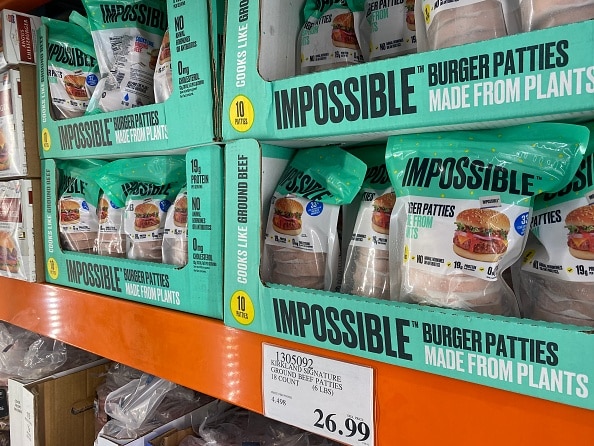
Impossible Foods, a company that makes plant-based meat substitutes, is rolling out a rebrand of its iconic green packaging. In hopes of persuading more carnivores to try its meat alternatives made from plants, the company has switched to red packaging designed to evoke the “craveability of meat,” according to a press release.
The rebranding was introduced on March 14, 2024 at Natural Products Expo West in Anaheim, California. Impossible Foods worked with Jones Knowles Ritchie (JKR), a creative agency that has worked with other major food brands like Burger King, Dunkin’ and Hippeas.
According to Impossible Foods, the newly unveiled red packaging is designed to appeal more to people who eat meat or are exploring a more flexitarian-style diet, which focuses mostly on plants and reducing, but not eliminating, meat consumption.
Impossible Foods said the rebrand helped further its original mission of offering plant-based meat products that tasted as good or better than animal meats while being more sustainable.
In a press release, Impossible Foods noted that about 90% of its customer base say they’ve eaten meat before. The company’s goal now is to have meat eaters consider other options that offer similar nutrients and meaty flavor with less environmental impact.
“We want to be inclusive to anyone who enjoys great food. It doesn’t matter if you’re a vegan, a vegetarian, an animal meat-lover, or somewhere in between,” said Peter McGuinness, president and CEO of Impossible Foods. “What we want to do is educate consumers that they can still enjoy meat by incorporating into their diet a version that’s made from plants instead of animals.”
As reported by Forbes, sales for plant-based meats have been declining, and a report from CoBank reveals this could be in part due to rising prices for groceries, but other factors like concerns over nutritional value, taste, texture and versatility could also be concerns for consumers. Impossible Foods hopes to address some of these concerns with its new rebrand, highlighting that plant-based meats can look and taste like animal-based meats.
Loyal fans have been debating the change on social media, with some loving the new red packaging, while others thinking it could be less appealing to those who don’t eat meat.
“This is not it! All I’m associating this with now is blood and actual meat. The green hue made me associate the brand with plants. Terrible branding decision!!  It wasn’t broken why’d you try fixing it?” one commenter responded to Impossible Foods’ announcement on Instagram.
Another commenter highlighted concerns over costs, saying, “All this hype to just… change it to red? Maybe reinvest the millions you paid the branding agency to use a color picker into making your meat cheaper than meat, which is the only thing consumers actually care about.”

Others loved the change and hoped it would do just what Impossible Foods wanted the rebrand to do: entice meat eaters to give these plant-based proteins a try.
“Loved your old colors but I get the change. More people eating Impossible instead of meat from animals is progress!  ,” one commenter replied.
Regardless of the initial feedback, the company feels strongly that its products will appeal to just about everyone, even those who aren’t strictly vegan or vegetarian.
“For a long time, meat eaters didn’t see us as something for them. But our mission relies on attracting meat eaters, so we wanted to do what we could to be more inviting in our approach and messaging,” Chief Marketing and Creative Officer Leslie Sims said in a press release. “We’re confident that once they try us, they’ll be in.”
The rebranding announcement comes amid a rollout of Impossible Foods’ latest new product, Impossible Hot Dogs, which is the first of the company’s products that will feature the new red packaging.
The post Impossible Foods Rebrands to Attract More Meat Eaters appeared first on EcoWatch.
